YouTube's Face Era Is Over: Why Neo-Minimalist Thumbnails Are Dominating in 2026
The exaggerated open-mouth reaction thumbnail is dead. Learn what's replacing it and how to create neo-minimalist thumbnails that get clicks.
Is the "YouTube Face" Dead?
Yes — the exaggerated open-mouth reaction thumbnail that dominated YouTube for years is losing its effectiveness. Even MrBeast has moved away from the shocked-face formula. In 2026, a new style called neo-minimalism is taking over, and creators who adapt are seeing significant CTR improvements.
What Killed the YouTube Face?
Three factors ended the era of exaggerated expressions:
1. Viewer Fatigue
After years of every creator using the same shocked-face formula, viewers developed "thumbnail blindness." When everything looks the same, nothing stands out. Research from hooksnap.io shows that reaction-face thumbnails now perform 23% worse than they did in 2024.
2. The MrBeast Effect (Reverse)
When MrBeast — the creator who popularized the style — started using calmer, more composed expressions, the entire ecosystem followed. His shift to "proof-of-human" authenticity (genuine emotions rather than performed ones) signaled that the formula had peaked.
3. Algorithm Changes
YouTube's 2026 algorithm now prioritizes viewer satisfaction over raw click-through rate. Thumbnails that over-promise (shocked face implying something amazing) but under-deliver (content doesn't match) now hurt your video's performance. The algorithm tracks whether viewers actually enjoy the content after clicking.
What Is Neo-Minimalism?
Neo-minimalist thumbnails strip away the noise and focus on one clear visual element that creates curiosity. Key characteristics:
| Element | Old Style | Neo-Minimalist |
|---|---|---|
| Expression | Exaggerated shock | Genuine, calm emotion |
| Composition | Busy, multiple elements | One focal point, clean space |
| Text | Bold, multiple words | Minimal or no text |
| Colors | High saturation, neon | Muted, intentional palette |
| Background | Detailed, busy | Simple, blurred, or solid |
5 Neo-Minimalist Thumbnail Styles That Work
1. The Quiet Intensity
A single face with a calm but intense expression. No screaming, no shock — just a person looking directly at the camera with purpose. Works especially well for educational and commentary content.
2. The Object Focus
No face at all — just a single compelling object against a clean background. A product, a symbol, or a visual metaphor. Works for tech reviews, cooking, and product-focused content.
3. The Split Story
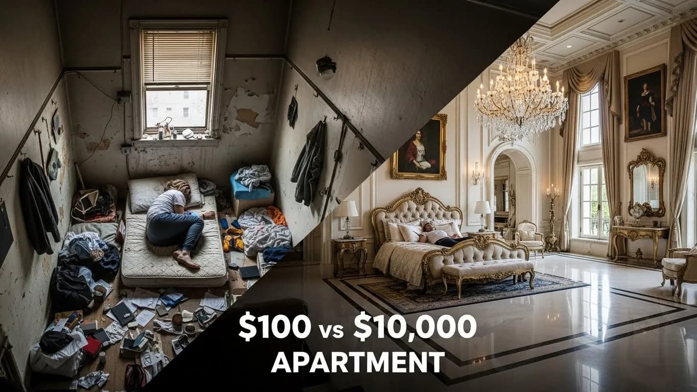
Two panels showing a before/after or comparison. Clean division, minimal text, clear visual contrast. Works for transformation content, tutorials, and comparisons.
4. The Negative Space
A small subject in a large, empty space. Creates curiosity through what's NOT there. Works for storytelling, mystery, and narrative content.
5. The Color Block
Bold, flat color backgrounds with a single subject. No gradients, no textures — just a striking color choice and a clear focal point. Works for branding and channels with a consistent visual identity.
How to Create Neo-Minimalist Thumbnails
Step 1: Start With One Idea
Ask yourself: "What's the ONE thing I want viewers to notice?" If your thumbnail has more than one focal point, simplify.
Step 2: Choose Your Emotion
Instead of "shocked," choose from: curious, determined, amused, thoughtful, concerned, excited (genuine, not performed). Match the emotion to your content's actual tone.
Step 3: Use Negative Space Intentionally
Don't fill every pixel. Leave breathing room around your subject. The empty space draws the eye to what matters.
Step 4: Limit Your Colors
Use 2-3 colors maximum. One dominant color, one accent, one neutral. Tools like Thumbnail AI Pro can help you find complementary palettes.
Step 5: Test the 3-Second Rule
Show your thumbnail to someone for 3 seconds. If they can't tell what the video is about, simplify further.
Before & After: The Shift in Action
| Old Approach | Neo-Minimalist Approach |
|---|---|
| Creator screaming at camera + "INSANE!" text + neon background + arrows | Creator looking thoughtfully at camera + clean background + no text |
| 5 visual elements competing for attention | 1 clear focal point with breathing room |
| Designed to shock | Designed to intrigue |
| High initial clicks, low satisfaction | Moderate clicks, high satisfaction, better algorithm performance |
Does This Mean Faces Are Dead?
No — faces still work. The shift is from performed emotions to genuine expressions. A real, authentic face with a natural expression outperforms both the old shocked-face style AND faceless thumbnails.
The key difference:
- ❌ "I need to look shocked even though nothing shocking happened"
- ✅ "I'll let my genuine reaction show"
FAQ
Should I stop using my face in thumbnails?
No. Faces still work — just use genuine expressions instead of exaggerated ones. A calm, curious look often outperforms a fake shocked face.
Does neo-minimalism work for all niches?
It works best for educational, commentary, and tech content. Gaming and entertainment content can still benefit from more energy, but even those niches are moving toward cleaner compositions.
Can AI thumbnail generators create neo-minimalist designs?
Yes. Tools like Thumbnail AI Pro can generate clean, minimal designs. The key is in your prompt — describe the emotion and composition you want, not just the subject.
How do I know if my current thumbnails are too "busy"?
Zoom out until your thumbnail is the size of a postage stamp. If you can't tell what's happening, it's too busy. Neo-minimalist thumbnails are designed to be readable at any size.
Create stunning neo-minimalist thumbnails with Thumbnail AI Pro. Our AI understands composition, negative space, and authentic emotion.